Projects at Energage
Profile Redesign
Research
During my role as a product designer for a SaaS company called Energage, I noticed that many of the companies listed on the awards page were missing profile pictures. This detracted from the overall user experience and made the page appear incomplete. However, I was unsure of the extent of this issue and decided to audit the website to gain more insight.
Using data analysis techniques, I recorded the number of companies without profile pictures and grouped them by size to identify potential patterns or trends. The results were surprising: 52.92% of companies were missing profile pictures, which was much higher than expected. This presented a significant problem as it detracted from the website's visual appeal and prevented companies from showcasing their unique work culture and values to potential clients or job candidates.


Design
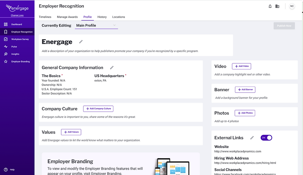
Following the data analysis, I conducted a comprehensive audit of the profile page using Fullstory to gain a deeper understanding of user behavior. Through this analysis, I discovered that users were frequently hovering around the photo upload modal, but not taking action to upload their profile picture.
To address this issue, I proposed a UI solution that involved redesigning the interface to improve the user experience. Specifically, I decided to mimic the company profile layout on the website to give users a clear idea of how their profiles would look at first glance. This would help users envision their profile as a part of the larger award website and motivate them to complete it.
To make the image and logo upload more visible, I increased the size of the boxes and modals, making them more prominent and eye-catching. This would draw more attention to the upload feature and encourage users to take action.
Overall, these changes significantly impacted the user experience and increased the number of companies uploading their profile pictures. By creating a more intuitive and user-friendly interface, the website improved its visual appeal, enhanced the user experience, and provided more value to both companies and users.


Building the Design System
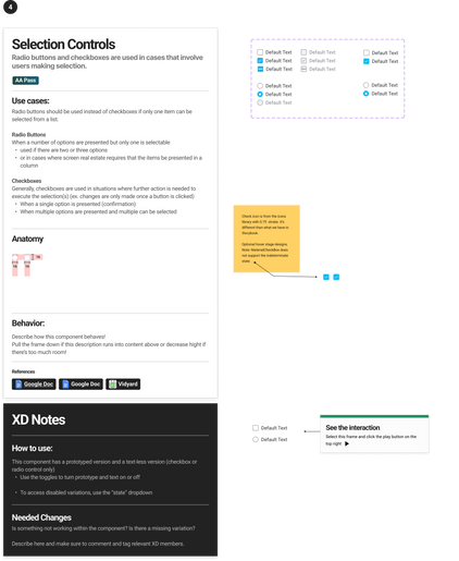
In response to the company's shift from Sketch to Figma, it became necessary to redesign the existing design system and components for compatibility with the new platform. As a member of the design team, I was responsible for creating new components and prototyping them using Figma. This involved a thorough understanding of the platform's interface and design conventions and attention to detail in ensuring consistency and cohesiveness across all design elements. Through this effort, we successfully transitioned the company's design system and components to Figma, allowing for more efficient and effective collaboration among the team members.
Pendo Redesign
The Pendo modal designs employed by the company were observed to need to be updated and aligned with the current design system in use. To address this, I undertook a redesign of the Pendo modals, focusing on ensuring their conformance to the current design system.


